Bedding · Bedroom styling
Duvet Covers and Bed Skirts: How to Build a Coordinated Bed
A bed is a small landscape of layers: a protective cover above, a tailored edge below, and the frame and floor quietly shaping the whole. A duvet cover and bed skirt do different jobs, but thoughtful choices in colour, texture, proportion, and care can make them feel like parts of the same design.
Published November 2, 2026
Two layers, two distinct purposes
A duvet cover is the removable textile that encloses a duvet insert or comforter. It protects the filling from everyday soil and provides one of the bed’s largest visible fields of colour and texture. A bed skirt, by contrast, hangs from the mattress or foundation and covers the space between the bed and the floor. It can conceal a box spring, frame, or stored items, and give the bed a more finished outline.
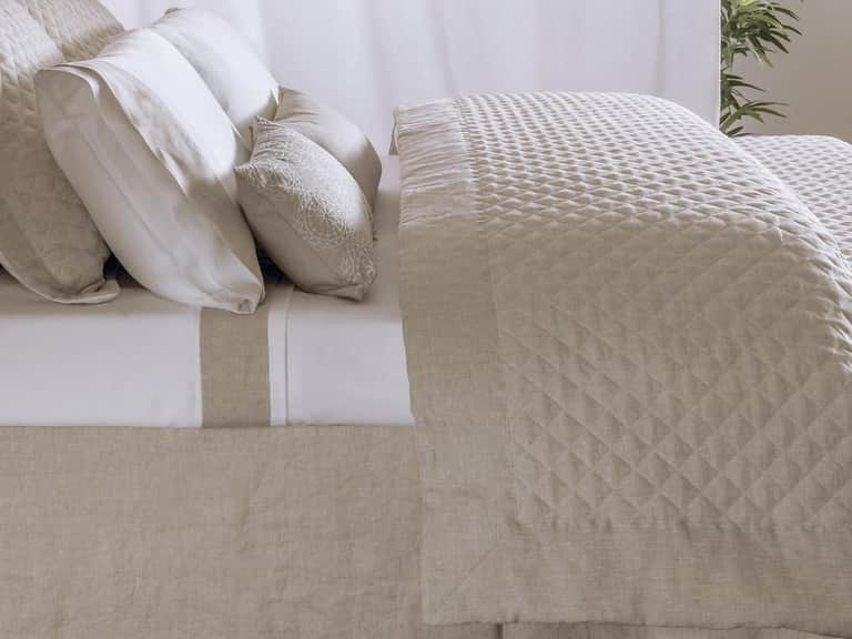
Because one layer sits at the top and the other at the base, they need not match exactly. In fact, a coordinated bed often has more depth when the pieces share a visual relationship rather than a repeated pattern. A quiet linen duvet cover, for instance, can sit above a solid skirt in a related shade. The connection might come from colour, weave, finish, or a small detail repeated elsewhere on the bed.
Think of coordination as a conversation between layers. The duvet cover sets the main tone; the bed skirt anchors it. When each piece competes to be the centre of attention, the bed can look busy. When the skirt disappears entirely against the floor and frame, it may lose its defining purpose. A considered balance lets both contribute without demanding equal notice.
Begin with the bed’s proportions
Before choosing a colour or fabric, measure the bed. A bed skirt’s drop is the vertical distance from the top of its platform or foundation to the point where the fabric should end. Measure from the surface that will actually support the skirt, rather than assuming the mattress edge is the starting point. Bed frames, foundations, mattress depths, and platform designs vary, so measurements matter more than a generic size label.
Decide whether the skirt should stop just above the floor, skim it, or rest lightly against it. A skirt that is too short may expose the foundation or stored items below. One that is too long can bunch, drag, or interfere with cleaning. The right length depends on the bed’s construction and the look you want, as well as practical matters such as floor clearance and access to under-bed storage.
For example, the Bovi Hudson Linen Bed Skirt is described as a tailored, lined design with an 18-inch drop. That stated measurement is a useful starting point for comparison, not a substitute for checking the actual height of your own bed. Measure carefully, and confirm the product’s dimensions and construction before deciding whether it will suit your frame.
The duvet cover needs its own proportion check. Match its dimensions to the insert, not just to the mattress. A cover that is too small can compress the insert and leave the corners poorly filled; a cover that is too large may allow the filling to shift or gather. Check the closure and any interior ties or other attachment points, then compare the cover’s finished dimensions with those of the duvet you intend to use.
These measurements are especially important when bedding comes from different makers or regions, where size conventions may differ. “Queen” or “king” can be a useful guide, but the listed measurements offer a more reliable comparison. Confirming the bed skirt’s drop and the duvet cover’s dimensions before purchase can prevent a mismatch that no colour pairing can fix.
Choose a colour relationship, not necessarily a set
There are several ways to link duvet covers and bed skirts. The simplest is a shared colour family: warm white with flax, cool grey with soft blue, or cream with a muted brown. The shades do not need to be identical. A small difference can create subtle depth, particularly when the fabrics have distinct surfaces.
A tonal approach uses variations of one colour. A pale duvet with a deeper skirt can make the lower edge of the bed feel grounded, while a darker cover above a lighter skirt produces a different emphasis. If the room already contains strong colour in curtains, rugs, or painted walls, a restrained pair of bedding layers may bring calm. If the room is mostly neutral, a deeper skirt or patterned duvet can add definition without requiring a full change of palette.
Another strategy is to repeat a colour from an existing element. A narrow stripe in the duvet cover might echo a tone in the rug; a skirt in a natural flax shade might relate to a timber floor or woven accessory. Repetition gives the eye a route through the room, but it works best when it remains selective. Repeating every colour and pattern can make a room feel overly arranged.
White is not a single visual experience. It may read as crisp, creamy, or subtly grey depending on surrounding materials and the light in the room. Natural fibres can also vary in shade and surface. If pairing items from different collections, compare their descriptions and, where possible, samples in the room’s own light. A small difference between two whites can be intentional, but it may be distracting if the aim is a seamless match.
Patterns need room to breathe. If the duvet cover carries a prominent stripe or motif, a plain bed skirt usually provides a steady base. If the cover is simple, a skirt with visible texture or a subtle detail can add interest near the floor. Two patterns can work together when their scale and colours are compatible—for example, a broad, quiet motif with a finer stripe—but the relationship should be judged from across the room, not only at close range.
Let texture do some of the work
Colour is only one part of coordination. Texture can distinguish layers while keeping them visually related. Linen, cotton percale, cotton sateen, and blends each have different appearances and handling qualities. Linen commonly has a visible, relaxed surface; percale is generally associated with a crisp, matte feel; sateen has a smoother face and more sheen. The exact result depends on the fibre, weave, finishing, and construction of each item.
A bed dressed in the same material from head to foot can look coherent, but it may also appear flat. Combining related textures offers a more nuanced effect: a softly rumpled duvet cover above a smoothly tailored skirt, or a quiet cover paired with a skirt whose woven surface is noticeable at close range. The key is to keep one layer visually quieter when the other has a strong texture or decorative finish.
Consider how fabric weight affects the silhouette. A heavier skirt may hang with more body, while a lighter one may move more easily and reveal the shape of the foundation beneath it. A duvet cover’s weight influences how it drapes over the insert and how much of its surface is visible. The descriptions “lightweight” or “heavyweight” are not enough by themselves: look for material details and dimensions, and consider how the fabric is intended to be used.
Linen bedding is often chosen for its natural texture and relaxed character. A set such as the DownTown Company Layla Linen Sheet Set can help establish a breathable, softly textured foundation beneath a duvet cover. Sheets are not a substitute for a bed skirt, but they are part of the same visual field when the bed is turned down or made with open layers. Keeping their tone and finish in mind can help the entire bed feel considered.
Construction details also influence the overall impression. A tailored edge, hemstitch, flange, or visible seam can introduce a small note of structure. If the duvet cover has a pronounced border or decorative trim, a simpler skirt may keep the design balanced. If both pieces are understated, a refined edge on the skirt can provide a quiet finishing detail.
Treat the bed as a layered system
A coordinated bed is more than two textiles selected in isolation. The mattress, foundation, duvet insert, sheets, pillowcases, shams, and bed skirt all contribute to its final shape. A duvet cover occupies the broadest visible area, but sheets and pillow layers can either connect it to the skirt or introduce another competing colour.
Start with a simple hierarchy. Choose the duvet cover as the primary surface, then select the skirt to support it. Add sheets and pillowcases in a shade that bridges the two or repeats one of them. Decorative pillows can introduce a small accent, but they should not have to solve a mismatch between the main layers. If the bed feels unsettled, remove one element and reassess before adding another.
Consider the room’s architecture and use. A bed skirt can soften the lower outline of a frame and conceal what is beneath it, while a more open bed with visible legs may suit a room where the frame itself is part of the design. If storage is used under the bed, a skirt can conceal it, but frequent access may influence whether a full, floor-length design is practical. The best choice supports both the room’s appearance and its ordinary routines.
In compact rooms, lighter colours and quieter patterns can help the bed feel less visually dense. In a spacious room, a darker or more textured skirt can give the bed a clearer boundary. These are starting points, not rules: natural light, wall colour, flooring, and the scale of the bed all affect how fabrics appear. Consider the bed in the context of the room rather than judging the duvet cover and skirt separately.
Plan care before combining fabrics
Care instructions are part of the design decision because a polished bed depends on textiles that can be maintained in a way that suits the household. A duvet cover is typically removed for laundering more often than a bed skirt, but its care still depends on fibre content, finishing, and manufacturer guidance. Check the label before washing, and do not assume that two pieces made from linen—or two items in similar colours—can safely be treated alike.
Compare recommended washing temperatures, cycle settings, drying methods, and ironing guidance. A delicate wash and low-temperature drying may suit one fabric, while another item may call for a different process. If one piece requires special handling and the other is designed for straightforward machine care, consider whether that difference is workable for you. Care compatibility does not mean that the items must be laundered together; it means you understand the attention each requires.
Before washing, fasten closures and follow any instructions about turning items inside out, separating colours, or avoiding bleach. Do not overload the machine: crowded fabric may not rinse or move freely. Remove bedding promptly after drying where the care label recommends it, and store it only when fully dry. For a bed skirt that is not washed as frequently, routine airing and careful vacuuming around the bed can help keep the area tidy, while any direct fabric cleaning should follow the manufacturer’s directions.
Natural fibres may soften or change in appearance with use and laundering. Linen, in particular, is often valued for a relaxed surface rather than a permanently smooth one, but the final look varies by weave and finish. Decide whether you prefer a crisp, pressed bed or a more casual drape. That preference can guide choices about fabric, finishing, and ironing—and help ensure that the duvet cover and skirt age in a way that still feels harmonious.
A practical checklist before choosing
Measurements and care details are easier to compare when collected in one place. Before pairing a duvet cover and bed skirt, use this checklist:
- Measure the bed: Record the mattress, foundation, and frame dimensions, along with the distance from the skirt’s attachment point to the desired hem.
- Check the duvet and insert: Compare their actual dimensions and confirm that closures or ties can hold the insert securely.
- Decide on the hem position: Choose whether the skirt should sit above the floor, skim it, or meet it, accounting for floor access and storage.
- Choose a colour strategy: Use a tonal palette, repeat a colour elsewhere in the room, or let one layer provide a restrained accent.
- Balance pattern and texture: Pair a bold surface with a quieter one, or make sure two patterns differ in scale and share compatible colours.
- Read the care labels: Compare washing, drying, and ironing requirements before committing to a combination.
- Consider the full bed: Include sheets and pillows in the palette so the duvet cover and skirt do not appear disconnected from the layers between them.
When comparing options online, focus on verifiable details: fabric composition, finished dimensions, stated drop, closure design, included components, and care directions. Product descriptions may use broad terms such as “natural,” “soft,” or “luxury,” but measurable information is more useful when deciding whether two pieces will fit and function together. If a measurement or care instruction is unclear, seek clarification before purchase rather than relying on a photograph or a general size name.
Common mismatches—and how to correct them
A skirt that is too short is one of the most visible proportion problems. If it exposes the foundation, confirm where the measurement begins and whether the bed frame height has been included. A skirt that pools on the floor may need a different drop or a change to the bed’s setup; repeatedly tucking or folding excess fabric can make the finish uneven.
A duvet cover that looks limp or overfilled may not match the insert’s dimensions. Check both measurements, and make sure the insert is distributed evenly before judging the cover’s drape. A cover can be the right nominal size and still feel wrong if its actual dimensions differ from the insert or if its construction does not hold the filling in place.
Colour mismatch can also arise from lighting. A fabric that looks warm in one room or on a screen may appear cooler under different light. If precise coordination matters, compare samples in the bedroom at more than one time of day. If exact matching is difficult, move toward a deliberate contrast—such as white and flax—rather than settling for two shades that almost but not quite agree.
Finally, avoid making every piece identical simply because a set is available. Repetition can be elegant, but coordination can also come from contrast and proportion. A plain skirt, textured duvet cover, and understated sheets may create a more natural composition than matching fabrics throughout. The aim is not uniformity; it is a bed whose parts appear to belong together.
A composed bed, built for everyday life
The most successful bedding arrangement is not merely a finished picture. It must be comfortable to sleep in, easy enough to care for, and suited to the bed beneath it. The duvet cover protects the insert and directs the room’s visual character. The bed skirt gives the lower edge a deliberate finish and can conceal the structure below. Each has a practical purpose, and their partnership works best when neither is asked to do the other’s job.
Begin with measurements, then choose materials and colours that support the room rather than compete with it. Let texture provide distinction, keep the duvet insert and cover properly matched, and check the skirt’s drop against the actual frame. Finally, compare care instructions so the arrangement remains manageable long after the bed is first made.
In a well-coordinated bed, the details are quiet but clear: a cover that settles naturally around its insert, a skirt that falls at the intended height, and a palette that connects the layers without forcing them into sameness. The result is a practical, composed foundation for the room—one that feels finished in the morning and welcoming again at night.